What holds your customer long on your website?
Well, if you think it’s your top-notch services, you are absolutely wrong. The first thing that a user looks into your website is its design theme format.
While designing a website, it’s essential to consider all the points that allure the visitor and binds them with the site. The whole web design process encompasses multiple segments that include UI/UX design. The reason behind giving a unique UI/UX is to deliver the best user experience to the audience along with the stuff they are looking for.
Design is not just what it looks like and feels like. Design is how it works. — Steve Jobs
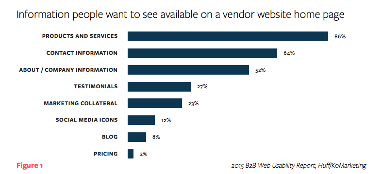
6.86% of visitors are entered on a company’s website homepage in search of the Company’s products and services.

Now, what are the focus points that you should consider while designing a distinct website for your customers? Below are some of the critical but simple hacks that you can easily follow and improve the website user experience from all aspects:
Eliminate the don’ts and take a solid entry with all the Dos. So first,
Don’ts
Irrelevant Content
Irrelevancy always mess-up everything and confuse your user ultimately, which will be overloaded and permit them to take the exit. You should inform your users by facts, statistics, and trending examples which leads to creating satisfactory outcomes from their side.
Stop doing irrelevancy and start talking exclusively. Be exclusive in terms of your content presentation as there is limited screen space available on different devices. By writing unnecessary clutter, you’ll get fake or irrelevant leads for your product/ service and leads to a reduction in conversion ratio.
Waiting for Site loading
When the site is loading, a white screen is coming in front, which looks like a mobile app is frozen. That’s not an excellent impression of your website at an initial level. Your site should be technically strong to avoid waiting for site loading time.
It requires an SEO concept to apply, which leads to further disturbance in website design. This is the hassle-free step to design an SEO-friendly website. If you want to meet the expectations of your potential customer, try to develop your website design which takes a maximum of 2-3 seconds.
Dead- End Pages
Avoid developing dead-end app pages which can destruct the user flow. Otherwise, the User will get confused, and chances of bounce rate will increase, and the customer will take the exit from your site.
For example– If you purchased an item and didn’t find the payment mode section, you’ll surely leave without buying anything. It seems to lose the value of your development. It does not create internal as well as external linking. These act as blockers for you and your users too.
Stop talking in Technical Jargon
Every single word in your mobile app solution is part of the conversation between users and your app. Try to make everything comfortable in terms of words and phrases you’re appealing to in your content. It will be better to use simple and accurate language to create clarity in what you want to convey to them and help them to solve their queries at your place.
It requires specialized knowledge regarding a specific field. All users are not having the same sense of understanding. You are here to solve their doubts not to mislead them. As much you present your information efficiently and appropriately, as long, they’ll hold in your website to gain more.
Don’t reveal Pop-up too early
Pop-up has proven as a negative impact on the web page when it is popped too soon. Pop-ups are a headache by nature since they are frequently used to show ads, and ultimately, users close them before reading your content, i.e. hours spend to clarify their queries will be wasted.
You can use Pop-ups after holding 2 minutes as any user will at least take time to go through the content and find their solutions. Pop-ups aren’t negative but how you effectively utilize them is important.
Do’s
Design Solely for Users
It is more important to create the website experience than what the website says. Your user should keep on hold on your website, and they should feel like WOW! they know me so well. This is a big myth that creates your website with maximum functionality, interactive elements, and designs that will ultimately add on more customer traffic to your website and create a stunning Users’ experience.
UX design is a significant piece of application and web work. Your Content will work only when Users get impressed by your theme presentation of your website and want to scroll more. Your text style, size, and color will make them instantly feel to solve their queries and educate more. Your android application design should be built a link to connect users from top to bottom.
Finger-friendly Tap
It is more challenging for users to hit smaller touch targets than larger ones. Making your goals big is the best way to make them accessible for users to tap while designing mobile interfaces. No doubt matching your touch target sizes to the average finger size enhances mobile usability for many.
Make sure that all interactive elements are at least 1cm/1 cm (0.4in/0.4 in) in physical size, rendered, and placed with sufficient space from other competing touch targets to be acquired easily and accurately. Too small goals result in lots of errors in the acquisition and are supposed to cause user frustration.
CTA is the Need of Hour
Lead generation and a boost purchase are the primary business objectives for calls-to-action creation. When a button design is sufficiently compelling to attract the attention of potential customers, it may attract them to click and go to the next stage, such as scooping out a short contact form or making a product preorder.
Read more: Who is best In-house Team VS Outsourcing
Call-to-action buttons are one of the most potent weapons to play e-commerce sales and an essential factor in a page or screen’s good conversion. To present your deals and unique services, you should optimize a single button which is the headmaster of all.
Easy navigation: Where to go
Start with the rule of thumb: Your website navigation structure should allow somebody to land and navigate the different pages on your site.
Website navigation is one of the sharp factors to consider because if visitors are unable to discover your web form, it doesn’t matter how gorgeous it is. Whether it’s in the manner of a breadcrumb menu, a dropdown, or tabs, every product needs a user flow that a person can locate to meet their goals.
A user is coming to your website to solve their queries. So, it’s your duty to present a flawless navigation structure that helps them to get the solution and know more; otherwise, it leads to bounce the user from your web page.
Pre-launch testing
Everything can be settled down before going live and operational. What have you done should be checked and analyzed to improvise in a better way and can make changes accordingly? Pre-launch testing is very important to avoid failure after going live.
Make sure while testing on any browser, don’t forget to test your site on various hardware. People should be able to use your site on a mobile device or tablet, as well as on each operating system. If you are running an eCommerce site, your add-to-cart section and checkout section must be functioning correctly to end up as a successful conversion because nothing should hurt your conversion rate more than a bad experience of checkout.
Wrap-up
When people engage with websites, they expect an outstanding m-commerce customer experience. But, If you don’t meet their needs, they’ll move to your competition, which could be just a click away. The app only demands standard words that do not raise the user’s mental load.
You should keep in mind while making a design that every single business strategy needs to implement while designing the website from a user as well as a businessman’s point of view. What are you waiting for? Boost your app design with us now.

