Animation is one of the many resources you can use to create an interactive interface with a good design. It is not an essential element, such as texts and images and in certain cases, when small animations are implemented they can go a little unnoticed since the user is accustomed to finding them on a website.
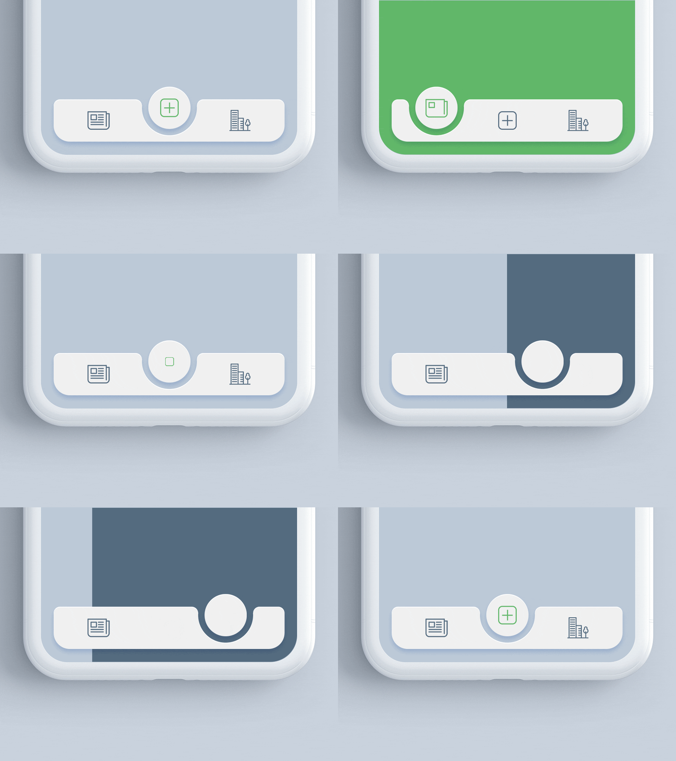
A clear example would be the color change of call-to-action buttons when the user clicks on any of them. The user notices the change and this effect allows the user to communicate a message, however, it may not leave a great impression on him.
In general, a correctly implemented animation can improve the user experience. In this article, we mention how and in what situations animations on a website can optimize the user experience.
Keep Users Interested While The Page Is Loading
Every page requires a loading time. It depends on the number of resources that each page contains, as well as the connection speed of each user. However, users are impatient and it is better to keep the loading time of each page to a minimum, to prevent visitors from leaving the page.
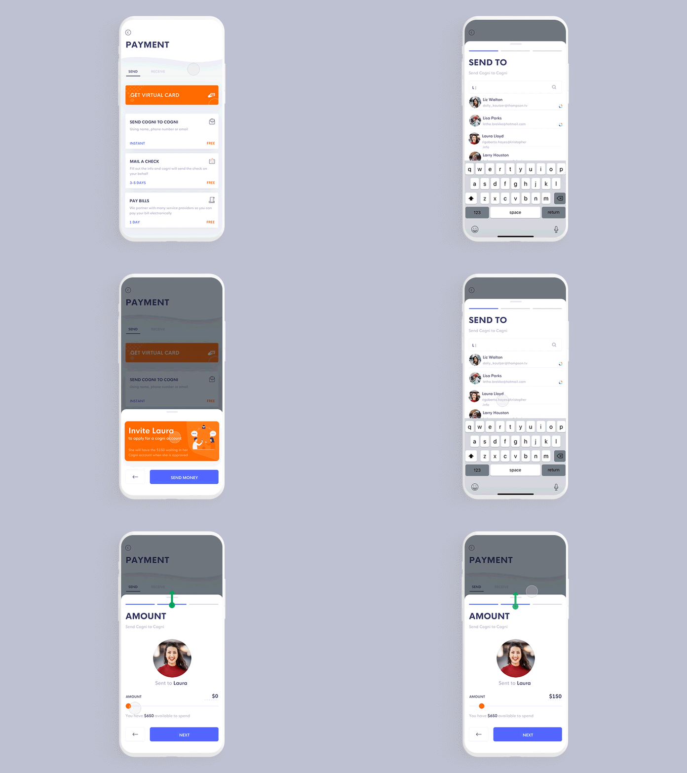
Without a doubt, the loading time affects the user experience of your website. However, in certain situations you have no other option, you have implemented techniques to minimize the charging time, but it still exceeds the recommended limit.
Read more: Hire PHP Programmer for Your Next Project
In these cases, you can use loading animations. Although these animations do not solve the problem itself, they can serve to distract users, so the wait becomes shorter because they are enjoying an entertaining animation.
There are many examples of creative loading animations in Codepen that you can take as a reference to make your animation and implement it on your website.
Help Users When They Encounter An Error
Errors, like loading time, are inevitable on a website. And we refer to those design flaws that can be solved, but we talk about certain inevitable situations in which users find a fault or error. A clear example is the different HTTP status codes that describe certain server errors. One of the most common is the 404 error that occurs when the resource requested by the user cannot be located.
Although users have already encountered these notifications before, they cannot help feeling frustrated when encountering this small obstacle. In this type of situation, to dissipate the tension that may arise a little, it is necessary to have a good page layout that offers other options for the user. Additionally, an animation could help to turn an unpleasant experience into a really pleasant one.
Invite Users To Interact
In certain specific cases, good animation has the power to motivate users to interact. It doesn’t need to be surprising at all, often a simple arrow at the bottom of a hero image can guide users and encourage them to click to continue viewing the other sections of the page.
Or you can apply a simple effect to the ends of a call-to-action button to make it more striking. These are just some examples of small animations that can have a positive impact on users.
Read more: New Technologies To Benefit Patient
On the other hand, you can also use more complex animations. For example, activate animations when the user scrolls down on the screen as is usually done in the scrolling parallax. Often we only see how a photograph moves at a slower speed than the text. But you can use illustrations or openwork photographs to add a more shocking effect to this type of animation.
Facilitate Some Process or Task For Users
On a website, both the layout and the menu should facilitate user navigation. All processes must be simple and the user should not spend time performing certain actions, such as filling out a form. The requested data must be those that are necessary.
But it is not enough with this, the information must be grouped properly, choose a readable source and correctly label each field of the form. Many details must be taken into account when creating a form that is easy to complete.
Read more : A UX Comparison – Which Is the Better Option?
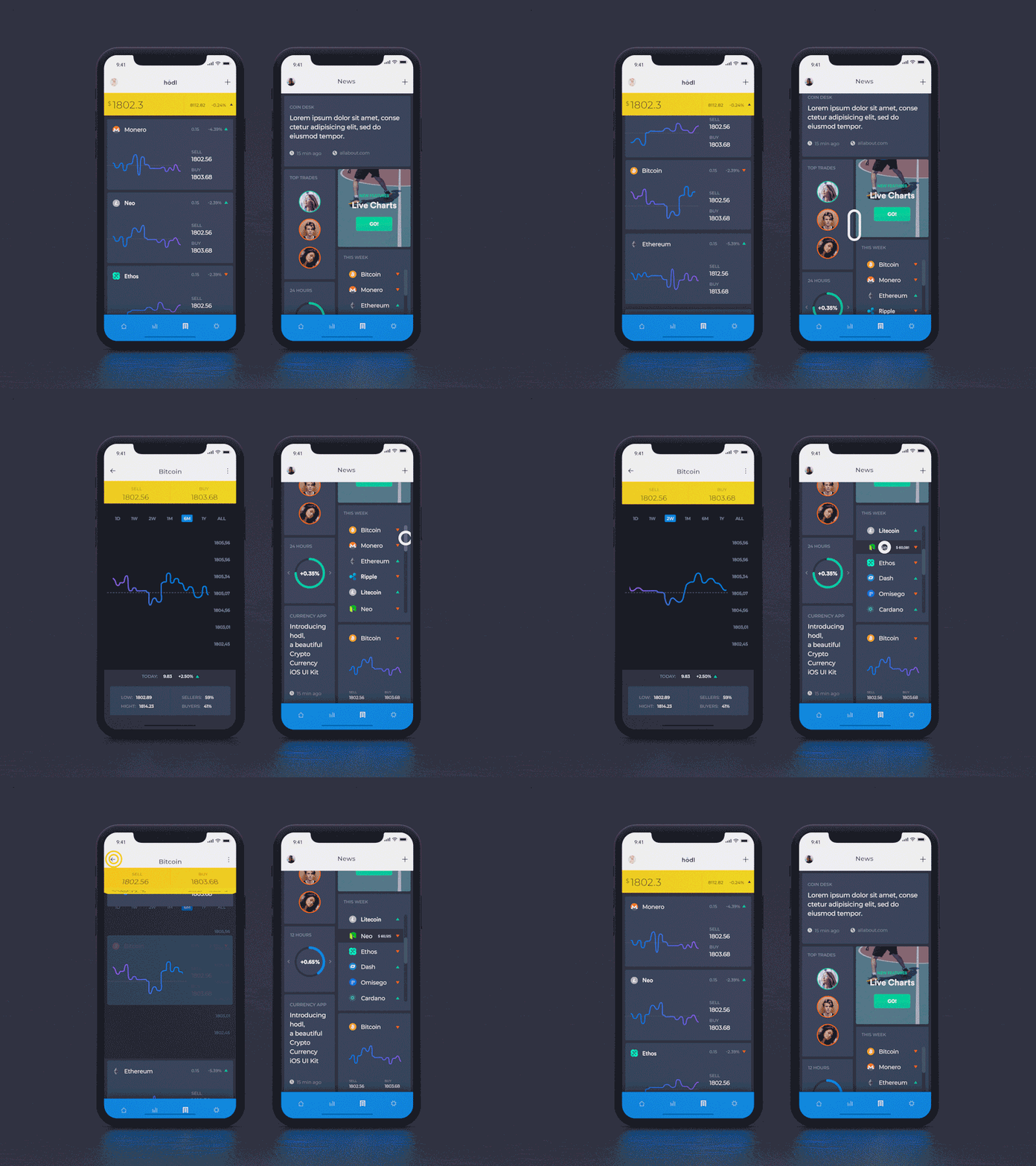
The same goes for other processes or actions that must be performed on a website. In some cases, animations can communicate a message effectively. For example, online stores present a small notification when a new item is added to the shopping cart.
Sometimes a message appears that indicates that the item has been added to the cart. Also, a number appears in a bubble in the shopping cart icon in the menu, a clear indicator of the number of items that have been added.
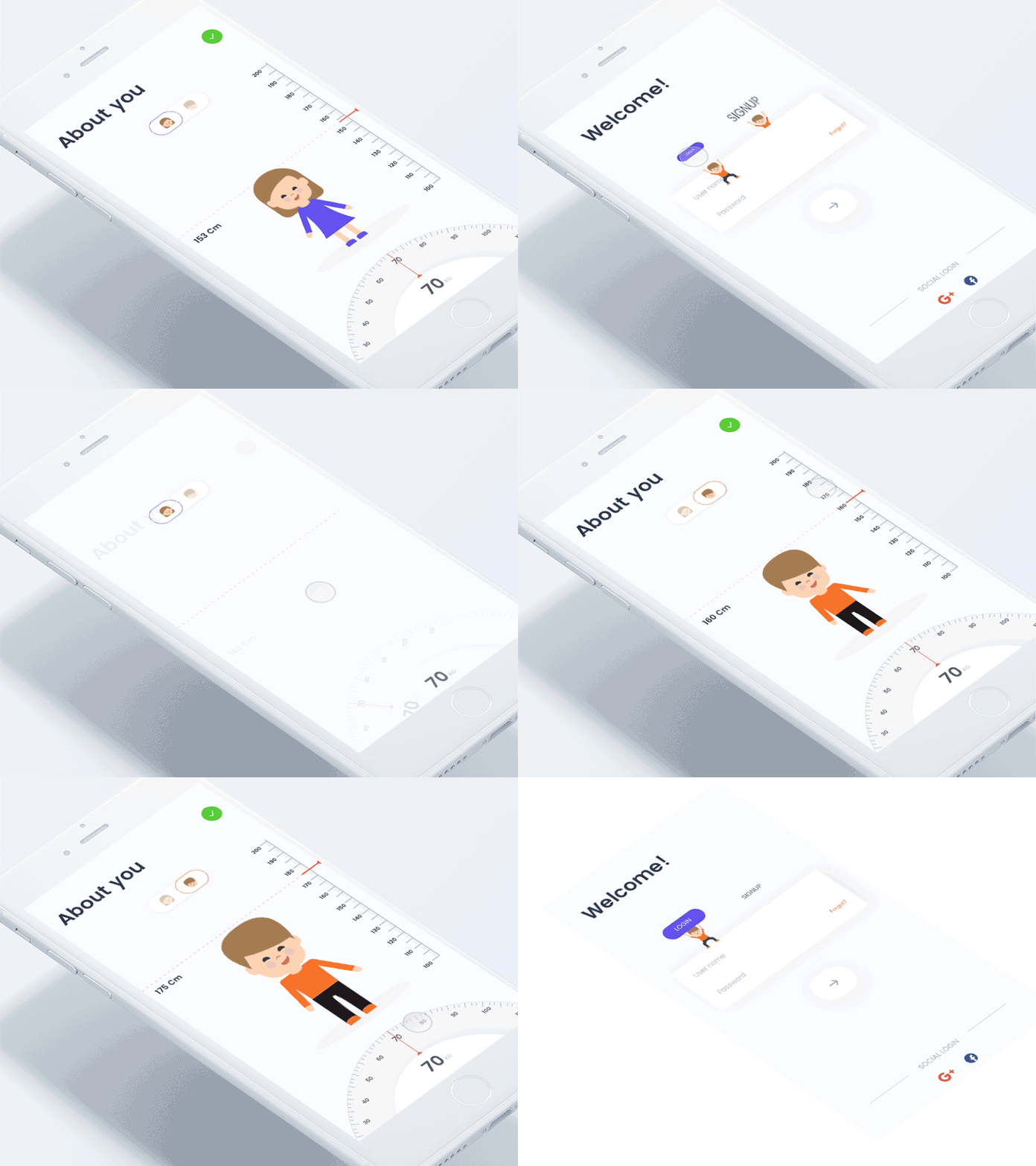
Give a Touch of Life To Your Interface
Effective and creative animations, implemented in the right areas can make the user experience more enjoyable. As we mentioned in the previous example, they allow improving the user experience in general. A fluid and creative animation can be the touch of life that the interface needs.
Despite the great potentials of animations, remember that each of them must have a specific purpose. Just as loading animations have a clear purpose and use, all animations that you decide to place on your website must have an objective. Carefully evaluate how these animations benefit your website before implementing them.

