A web framework (mocap) is essentially a schematic web page layout for a UI / UX designer. You can even draw the foundation by hand on a piece of paper, but it’s much more efficient to use wireframing tools since they will allow you to use the Drag and Drop tools.

Prototype development is the next step after creating a wireframe. At this stage, the designer selects colors and styles for the site. He delves into UI design and finishes planning a site or application, not forgetting the needs and wishes of users.
Why Wireframe is so Important?
In the work of a web designer, the words wireframe, prototype, and mockup are often found. These three types of tools are not the same. Even though the names of these tools are sometimes confused by inexperienced developers, and cannot always say how it differs from one another. The wireframe is a low-detailed design representation.
A free Wireframe tool for the mobile app is the skeleton of your design. The main thing in a wireframe should be presented with all the important elements of the final product.
The mockup is a medium or highly detailed static representation of a design. Very often, mocap is a draft design or even an actual design layout. Prototypes – Prototypes are dynamic.
The prototype, often confused with a wireframe, is a medium or highly detailed representation of the final product, which mimics the interaction of the user with the interface. Some prototypes may simulate the exact style of a website or mobile application. A prototype can be beautiful or terrible, but it should work with the functionality of the final product.
- Making a prototype of a mobile app is one of the simplest techniques to preview how the application will be developed, in terms of design, and without having to start programming a single line of code.
- Making an app prototype will save you a lot of time and work. Also, it will allow you to see in a very faithful way how the app will look and if it is necessary to optimize its design, appearance, and usability.
- If you are going to outsource the development of the app, this process will help you obtain a budget adjusted to what you need; If, on the other hand, you are on the developer side, the prototype will be the first installment that you show your client for validation.
- In case you wanted changes in the design, it will be much easier to make them from the app prototyping tool. You can even make several prototypes for the client to choose the one that best suits what they want.
The Variety of Prototyping Tools Available on the Market is Wide
The web design process is long. It requires exhaustive research and constant meetings with the client for the approval of sketches and progress.
Usually in each phase, the product that has been generated is sent to the client since the client must be present in the process from the beginning to avoid a greater number of reviews and minor changes in the final stages.
One of the products made for this purpose is the wireframe. In this article, we mention the benefits of creating a wireframe and why it is necessary for any mobile app design project.
Within the design process, there are a series of products that are generated throughout it such as wireframes, mockups, and prototypes. Not all projects generate all products, everything depends on budget and time.
The Role of Wireframe in Mobile Apps
Likewise, the quality of some products varies from project to project due to the previously mentioned factors. However, there is a product that must always be produced without taking these factors into account: the wireframe.
The free Wireframe tool for the mobile app is the initial representation of a design. In other words, it is considered a sketch. It works on paper and can be improved as the hour’s pass and ideas are discarded or approved together with your team members. Since it is a sketch, it must be considered in any design process.
Wireframe. It is a kind of sketch of the mobile application in which we define, without any style or design, what things should appear and where they will be in our app.
We will also add a visual explanation of what the interaction will be like. It is important to work from the base since these wireframes are the skeleton of the mobile app. The idea is to make them very simple: even a sketch by hand can serve as a starting point.
The Best free Wireframe for Mobile Apps
1. InVision
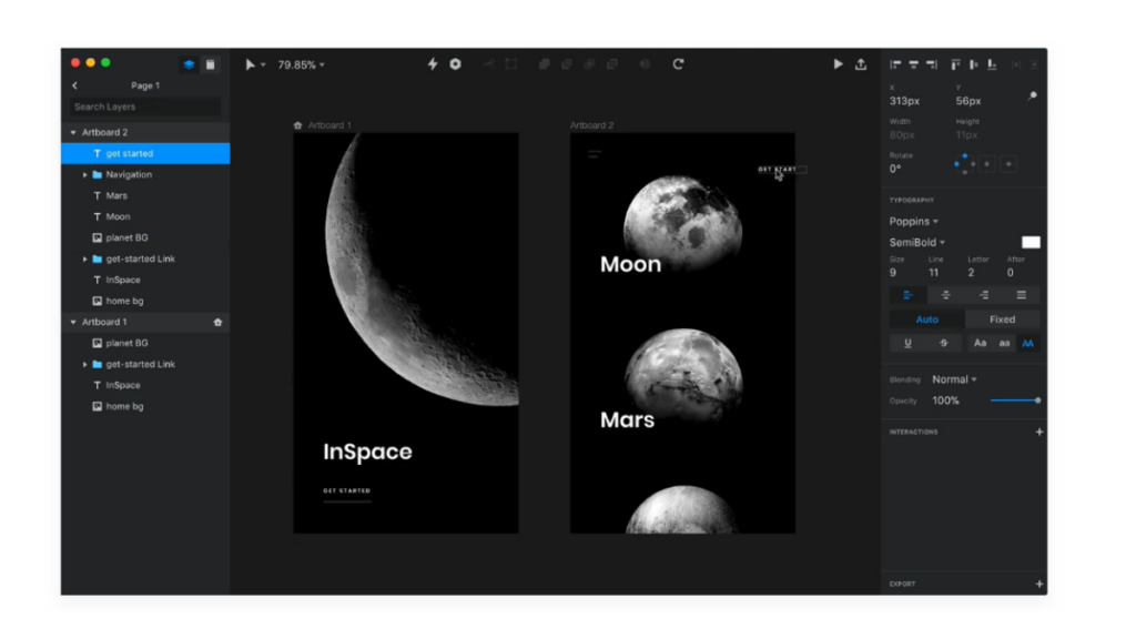
Platform Support: Browser-Based; All browsers
InVision is one of the most popular prototyping tools. I use brands like Twitter, Nike, and Sony. The software consists of simple drag-and-drop tools that greatly simplify the planning of UX design. You can test your prototype in a browser, smartphone, and even in real-time. InVision is also designed for interoperability and with support for cloud storage such as Dropbox, Google Drive, and Slack.
2. UXPi
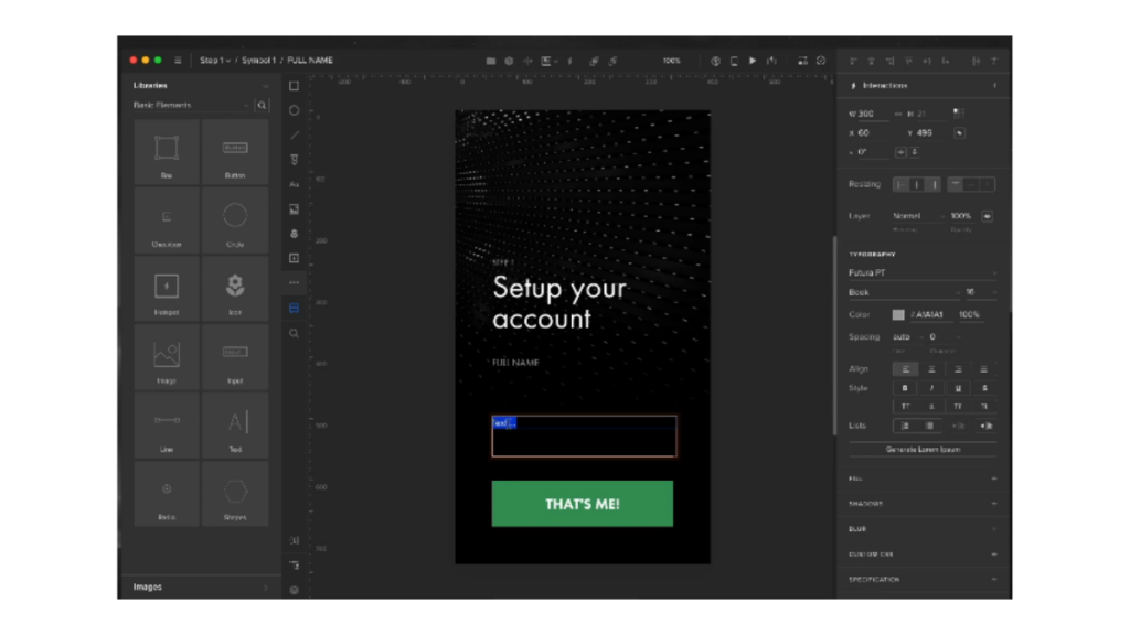
UXPin has a free rate.
Desktop application, Pen tool, Variable and conditional interactions, Local fonts, and API requests.
Platform Support: Browser-Based; All browsers
UXPin is a multifunctional tool that allows you to build wireframes and layouts before prototyping UX designs. This is another great online tool for the development team. In it, you can present your design to other team members, customers, and make changes in real-time. It is used by Microsoft, NBC, and USA Today.
3. Marvel App
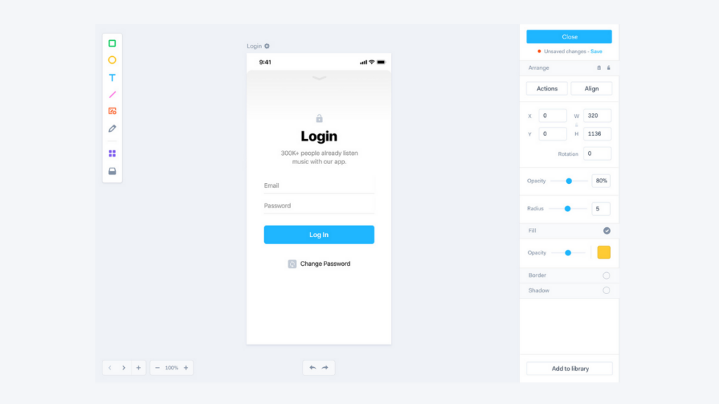
Platform Support: Safari; Chrome Firefox
The Marvel App is a tool that allows you to design a website structure before developing UX designs for responsive websites and applications. You can create your screensavers or use images created using Photoshop or Sketch. This tool also works in real-time, allowing team members and customers to leave feedback or create notes.
4. Gliffy
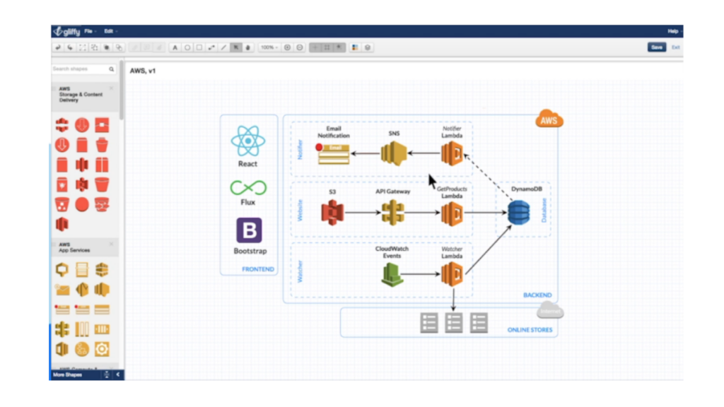
Platform Support: Browser-Based; All browsers
Gliffy is a multi-purpose tool for creating wireframes and flowcharts for new sites. Companies may like flowchart tools, and web designers will appreciate the ability to create simple web page designs.
5. OmniGraffle
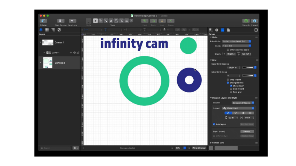
Platform Support: Mac and iOS
This multi-purpose tool from OmniGroup is not just for building website wireframes. OmniGraffle allows you to create the mainframe of your site in various ways,
It including using the iPad and Apple Pencil. It has a shape recognition function for those who prefer to draw their design rather than use the drag-and-drop tool.
6. Moqups
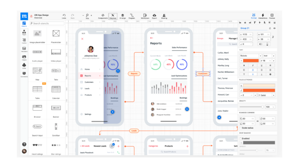
Platform Support: Browser-Based; All Browsers, Chrome App Available
Moqups is a wireframe and prototyping tool that allows you to create simple layouts for sites up to the UX design stage. You can connect links, add your images, export to PDF / PNG files, and much more.
This is a very convenient tool for presenting your ideas to clients and team members. It is used by Opera, Intel, and the Air Force.
7. Axure
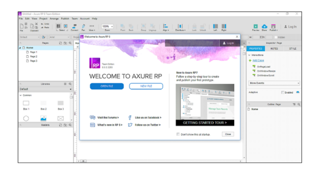
Platform Support: Windows and Mac
Axure is another multifunctional tool with which you can create wireframes and site prototypes for computer browsers and mobile devices. You can start in black and white, and then add logos, images, colors, fonts and test different versions of the UX design.
8. JustInMind
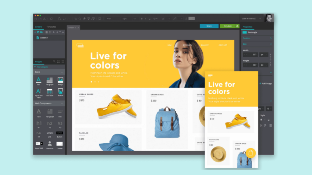
Platform Support: Windows and Mac
This popular tool for creating wireframes and site prototypes is used by Google, Adobe, and Oracle. It allows you to not only fully plan how your site will look, feel, and function, but also develop mobile and web applications.
Designers can take advantage of the integration of tools for the best work. This includes Adobe Illustrator to seamlessly transfer SVG files from Illustrator to Justinmind.
9. Mockingbird
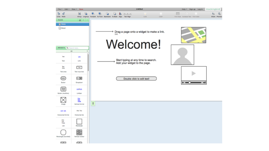
Platform Support: Browser-Based; All browsers
Mockingbird is a wireframe application with simple prototype UX design features. To quickly create a wireframe, use the drag-and-drop tool, with the help of UI elements you can link pages, and all this together will allow you to create a framework, style and site map in one tool.
10. HotGloo
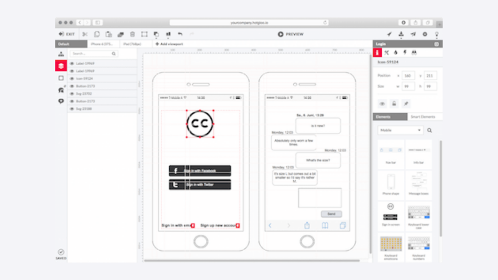
Platform Support: Browser-Based; All browsers
HotGloo is a framework and prototype tool used by companies like NBCUniversal, Disney, and Sky. It features adaptive wireframing, a complete list of UI elements, and ready-made UI stencils. Also great for use by the development team and coordination with the customer of all stages of work.
11. Mockplus
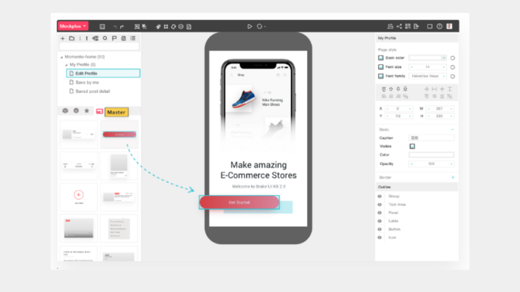
Platform Support: Windows and Mac
Mockplus is a simple wireframe tool and lets you move from a black and white wireframe sketch to a well-designed color layout. It has more than 200 preset components, which greatly simplify the creation of the frame. The project can be sent to clients and colleagues through the cloud.
12. Pidoco
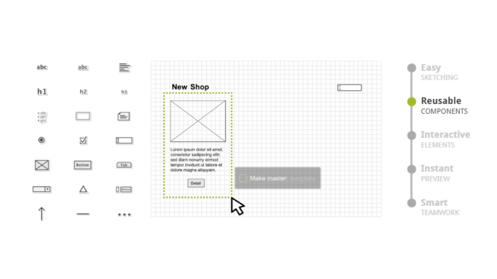
Pidoco is ideal for both web designers and mobile app developers. It is ideal for individual developers, and ideal for teams; especially because of simple training. Most novice users at Pidoco easily use the tool. This tool can also be used for wireframing, so it is a useful tool throughout the design process.
Your work can be previewed in your web browser / or on your mobile device. Pidoco is constantly happy with updates and friendly technical support. Prototyping using the Pidoco service does not require software installation on your computer and is available to you from any computer connected to the Internet.
Common Mistakes Prototyping
We want to bring to the fore four errors that occur very often and hinder the process of developing mobile applications.
Placing too much emphasis on design in the early prototyping phases. The small details of the design will be polished when everything else is ready, although it will always be useful to have a rough idea of the design, but with the possibility of making changes.
Forget the features that we want to include . Especially if we talk about outsourced projects in which the client does not know one hundred percent the development of mobile applications that he wants.
Leaving too many fronts open. Try to work on a solid proposal, even if it will be modified later.
Don’t assume that the customer is technical. In subcontracting cases like the ones it handles support service, this is seldom the case. You will always have to explain very well how the app works. If you think of your client like the most demanding and least experienced tester that will test your app, you will make a good mock-up or prototype.
Often the first use or the first day with the application is the most critical period for attracting a potential user. The first impression is so critical that it can be an umbrella for all other advanced mobile design techniques. If something goes wrong or seems confusing or boring, potential users will quickly leave.
Although the right balance for first impressions is complicated. In some cases, a lengthy adaptation process to discover the necessary functions is important to the user. However, without proper input, some applications simply confuse users if this is not intuitive. Creating an application that is immediately intuitive and quickly introduces users to the most interesting, attractive functions is a delicate balancing act.
Although this may be a good way to get someone to quickly navigate, a long introduction can also prevent users from doing what they want to do with the application. Often these tutorials are too long and it bothers. Keep in mind that when users first use the application, they do not necessarily have any waypoints for how the application should function or what it can do.
The in-house beta testing process allows designers to learn how others perceive the application from the very beginning. What seems obvious to the development team for beginners may seem complicated.
There are many factors to consider when designing a mobile device. We are sure that this detailed guide will save you from the headache when creating applications.
Today more than ever, people interact with their phones at critical moments. An average US user spends 5 hours a day on a mobile phone. The vast majority of this time is spent on applications and websites.
